google's website mobilefriendly
https://developers.google.cn/search/mobile-sites
1. Limit JavaScript
While JavaScript may add cool effects to your website, it also slows it down. It doesn’t matter whether it is the desktop or mobile site, JavaScript will have an impact on the site’s load time. But that doesn’t necessarily mean you can’t use JavaScript, there are a few tricks that can limit its impact on the site’s speed:
• Asynchronous JavaScript: This is a type of JavaScript loads all the scrip at once rather than one by one, which improves the speed prompts the script to load faster.
• Move the script to the bottom: Browsers load your website according to its code so as soon as they reach the JavaScript, they won’t load anything else until it is completed. If the script is moved to the bottom of the page, that allows the browser to load all the content and HTML aspect of the website quickly and then move on to the JavaScript. Visitors can easily browse your website and not have to wait for the information to load.

2. Optimize the images on the site
The size of images tends to be one of the biggest problems when it comes to a site’s speed. Images today are much bigger in size than ever before. Which means, when they are downloaded, they need a little more time. But they are also an important visual aspect of the site, so you can’t get rid of them altogether just to make your site faster.

Which is why you need to optimize the images you use. Before you upload them, you need to crop them to the size you want and compress them. By compressing them, you do reduce the quality but that shouldn’t be too much of an issue since most cameras take high-resolution images anyways. Even if you were to compress them to the smallest size possible, they would appear clear on mobile sites. Doing so allows you to drastically reduce the size of the image and enable your site to load faster.

3. Lazy loading
The wonderful thing about using a content management system such as WordPress is that there are numerous options of plugins to enhance your website. Lazy Load is a plugin that enables lazy loading on your website, both desktop and mobile. What it does is, it loads all the content on the website first and then moves on to images and other aspects. This enables visitors to read through the content seconds after requesting for your site. Therefore, they don’t have to wait for the whole site to load to get the information they need.

4. Limit the number of plugins on the site
With so many plugins available, site owners can go overboard and install plugins they don’t necessarily need. Each plugin you add puts more weight on the site and its code. Which means that when a user accesses the site, the plugin needs to be loaded before the design does. It is important that you only have plugins that are actually required and deactivate those that are not necessary. Also, make sure that the plugins you use are always up to date otherwise they can slow down your website.

5. Enable caching
Websites that are visited by a user more than once can load faster it caching is enabled. The process stores the most frequently requested files of the site on the user’s device. With the files stored on the device, the site will load much faster. Therefore, you need to enable caching. For those with a WordPress website, there are plugins for caching such as Cache Enabler.

It is important that you meet the expectations of mobile users by not only making your website responsive to mobile devices but ensure it loads within 3 seconds. The best way to do that is to follow the 5 tips listed above to improve your site load speed. They will improve the user’s experience on your mobile site which of course increases the chances of them opting for your services.
How to make your website load faster on mobile in 2020
Organic SEO is extremely valuable when it comes to generating leads and been seen before your competitors. Googles new algorithm means it ranks websites which are helpful and provide value to users. And as everyone seems to be on a mobile and in a hurry these days – a fast loading website on mobile devices is seen as helpful to Google. (and your website users!)
So how can you make your website load faster?
Use compressed images:
An easy way to dramatically increase your website speed on mobile is to make sure all of your images are compressed. Huge images take up loads of space which slows things down. You can easily compress your images using https://tinypng.com/ which allows you to upload your image and compress it automatically. Assuming you’re using WordPress, just upload the compressed image as a media file. And hey presto. Your website will run much faster on all devices!
If you are able to reduce the amount of images you use on your mobile site, this will also help! Try to stick to only showing content which is absolutely necessary.
Stay away from plugins that compress images for you as these plugins make your website clunky and ends up slowing things down anyway. (more on this later!)
Turn on browser caching:
When browser caching is activated, browsers can remember a websites pages which saves data when loading the page at a later date. You can decide what your website chooses to cache and how long for. Some typical examples of content that may be cached are:
Images, backgrounds and logos
CSS
JavaScript
HTML
Remove unnecessary plugins:
Plug-ins are made up of code that enables a website to use a specific feature. It is common for WordPress users to use plugins on their website as it means they can enable different functions to their site with no knowledge of code.
The issue with using plugins on a website is that unless it’s a plug-in that you trust, you don’t know how well the plugin has been coded. Adding poor code to your website will slow the site down dramatically. So it’s important to only use plug-ins that you really need.
Pick a great hosting provider:
What is a good hosting provider? Having the right hosting for your business can literally make or break your website. If you’ve been through this list and your website is still slow – you may need to consider switching your hosting.
A great hosting provider will provide speed, security and support for your website.
If you have a small brochure website, you will usually be able to opt for cloud hosting. This means your website is hosted with other people’s websites. But it’s cost efficient and easy to use.
If you own a website with more than 7 pages, it’s best to purchase a set amount of bandwidth from a hosting provider.
If you are running an ecommerce store, we always recommend using a VPS. (virtual private server) This means your website is hosted on its own rather than with other websites.This article explains techniques you can use to make your websites faster on mobile devices.
Why is mobile so important?
Smartphones quickly went from expensive, exciting new technology, to a regular part of everyday life. Today we find it strange for anyone to leave the house without their phone. From hospital waiting rooms to theater lobbies (back when they were open anyways), people staring at their phones is a normal sight.
For website owners, that means it’s past time for your website to provide a good mobile experience.
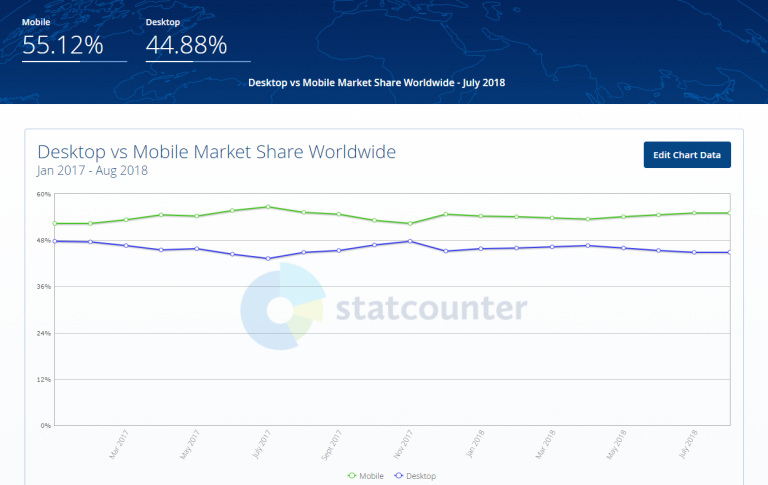
1)More than half of all web traffic comes from mobile devices
In 2016 for the first time, mobile internet usage surpassed computer usage. And the trend has only increased in the years since. Over half of all website traffic worldwide now happens on smartphones.
In 2018, the percentage of users that are accessing the internet through some sort of mobile device is increasing consistently while the percentage of desktop users are heading in the opposite direction.
2)53% of mobile site visits will leave a page that takes longer than 3 seconds to load.
According to Google., more than half of all web traffic comes from mobile devices, yet, on average, it takes about 15 seconds for mobile sites to load.
It’s far too slow when you consider that 53% of mobile site visits will leave a page that takes longer than 3 seconds to load.
A recent study (PDF) found that more than 80% of people are disappointed with the experience of browsing Web on mobile devices.
This isn’t surprising when 64% of smartphone users expect websites to load in 4 seconds or less.
3)Google recommends the following for mobile pages
Google recommends the following as best practice for mobile pages:
Under 3 seconds: How quickly the mobile page displays content to users.
Under 1.3 seconds: How fast and responsive a mobile web server is (i.e. time to first byte).
Fewer than 50: The number of individual pieces of content needed to display the entire mobile page.
Less than 500 KB: The total size of a mobile webpage, measured in bytes.
Connection speeds of smartphones
The most obvious factor is the connection speeds of smartphones. In the best-case scenario, mobile users connect to the Internet over 3G and 4G networks, with 4G networks being faster.
Download speed of smartphones
According to a study by PCWorld, the average download speed for 3G networks in the US is 2 Mbps, and 6.2 Mbps for 4G networks. A study by Ofcom found that the average download speed for 3G in the UK to be 2.1 Mbps. Outside of North America and Europe, connection speeds are generally slower. Because 1 Mbps equals 122 KB/s (or 0.12 MB/s), this translates into the following:
244 KB/s on average for 3G users (0.24 MB/s),
756 KB/s on average for 4G users (0.76 MB/s).
If you multiply that by the 4 seconds that mobile users are expecting to wait, this means the website could be a maximum of 1 MB for 3G users and 3 MB for 4G users.
bottleneck
However, download speed is not the bottleneck. The bottleneck is the network latency, smartphone’s memory and CPU. Even if the phone can download 1 MB in 4 seconds, the website will take longer to load because the phone needs to receive and process the code and images.
On a desktop, only 20% of the time it takes to display a Web page comes from downloading files. The rest of the time is spent processing HTTP requests and loading style sheets, script files and images. It takes even longer on a smartphone because its CPU, memory and cache size are much smaller than a desktop’s.
What is a Mobile-Friendly Website?
As the name implies, mobile-friendly websites are sites designed, developed and optimized for users on mobile devices – and this is both more complex and more important than it seems.
Is My Website Mobile-Friendly?
Checking whether you have a mobile friendly view or not is easy – Google has a mobile friendly website tester called Webmaster Tool to do exactly that, and it’s accessible right here.
https://www.google.com/webmasters/tools/mobile-friendly/
All you need to do is insert the URL of your web page and click on the ANALYZE button.
Once successful, you will get to view the mobile version of your website as Googlebot sees it:
LOAD IMAGES THROUGH CSS
If you want to hide content images from mobile users, relying on display: none or visibility: hidden won’t prevent them from being downloaded.
Instead, load them as background images in CSS, and use media queries to conditionally hide them.
<meta name="viewport" content="width=device-width">

<style>
@media (max-width:600px) {
   .image {
      display:none;
   }
}
@media (min-width:601px) {
   .image {
      background-image: url(image1.jpg);
   }
}
</style>

<div class="image"></div>
https://www.quickonlinetips.com/archives/2015/01/load-bootstrap-faster/
https://www.quickonlinetips.com/archives/2012/02/increase-site-speed/
https://www.smashingmagazine.com/2013/04/build-fast-loading-mobile-website/