Table of Content
what are the differences in Bootstrap 4 vs Bootstrap 5
Migrating from Bootstrap 3 to 4
what are the differences in Bootstrap 4 vs Bootstrap 5
1. Vanilla JavaScript instead of jQuery
Ever since Bootstrap was introduced, it utilized jQuery as a dependency to offer dynamic features such as menu expansion, carousel, dropdowns etc. However, this forced dependency on jQuery was not liked by many developers who wanted to use Bootstrap with modern JavaScript frameworks such as React and Vue.js. With Bootstrap 5, they have removed this dependency.
Note that this does not mean that there is no JavaScript dependency in Bootstrap 5. Behaviors such as dropdown, slider, popover etc. in Bootstrap 5 depends on Popper as well as its own vanilla JavaScript module. There will be no requirement of adding jQuery. If your project depends on jQuery, you can still add it.
2. Browser support – IE 10 and 11 support removed
With Microsoft moving its efforts completely towards Edge browser, Internet Explorer is fast losing market share. Moreover, Edge has adopted the open source chromium engine which allows it to have all the modern JavaScript and CSS features on par with latest version of Chrome and Firefox. Given this, Bootstrap team has dropped support for Internet Explorer which allows it to provide a modern set of features such as CSS variables, faster JavaScript and better APIs.
Here is a full list of browsers that Bootstrap 5 no longer supports:
- Dropped Microsoft Edge Legacy
- Dropped Internet Explorer 10 and 11
- Dropped Firefox < 60
- Dropped Safari < 10
- Dropped iOS Safari < 10
- Dropped Chrome < 60
- Dropped Android < 6
3. CSS custom properties
Thanks to dropping support for Internet Explorer, Bootstrap 5 now supports custom CSS properties. In Bootstrap 4 root variables were present for only color and fonts. Bootstrap 5 now offers CSS variables in a handful of components and layout options. For example, table component makes use of local variables to make striped, hover-able, and active table styles easier.
.table {
  --bs-table-bg: #{$table-bg};
  --bs-table-accent-bg: transparent;
  --bs-table-striped-color: #{$table-striped-color};
  --bs-table-striped-bg: #{$table-striped-bg};
  --bs-table-active-color: #{$table-active-color};
  --bs-table-active-bg: #{$table-active-bg};
  --bs-table-hover-color: #{$table-hover-color};
  --bs-table-hover-bg: #{$table-hover-bg};

  // Styles here...
}
4. Expanded color palette
Many CSS frameworks such as Tailwind offer an extensive set of color palette which has been quite popular with developers. Bootstrap 5 has now expanded its color palette to include more colors that are present in different shades such as $blue-100, $blue-200, $blue-300, …., $blue-900. This allows you to easily customize the look and feel of your app without ever leaving the codebase. You can easily override these colors with your own color palette using the color shades generator.
5. Updated Form Controls
Bootstrap 5 includes custom designed form controls. In Bootstrap 4 the form controls were using whatever defaults each browser provided. In Bootstrap 5 the form controls will offer much more consistent look and feel in all browsers due to its custom design.
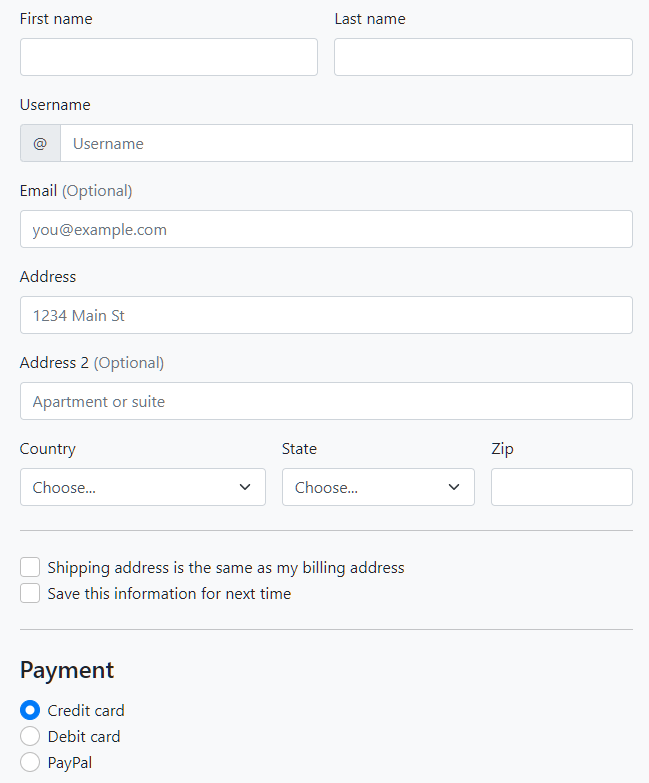
These new form controls are all built on completely semantic, standard form controls and thus there is no need of adding extra markups for form controls and labels.
<div class="form-check">
  <input class="form-check-input" type="checkbox" value="" id="flexCheckDefault">
  <label class="form-check-label" for="flexCheckDefault">
    Default checkbox
  </label>
</div>

<div class="form-check">
  <input class="form-check-input" type="radio" name="flexRadioDefault" id="flexRadioDefault1">
  <label class="form-check-label" for="flexRadioDefault1">
    Default radio
  </label>
</div>

<div class="form-check form-switch">
  <input class="form-check-input" type="checkbox" id="flexSwitchCheckDefault">
  <label class="form-check-label" for="flexSwitchCheckDefault">Default switch checkbox input</label>
</div>
6. Utilities API
A new utility API has been built into Bootstrap 5. You can use Sass to create your own utilities. You can also use the utility API of Bootstrap to modify or remove the default utility classes.
"width": (
      property: width,
      class: w,
      values: (
        25: 25%,
        50: 50%,
        75: 75%,
        100: 100%,
        auto: auto
      )
    ),
You can also now use the state option to generate pseudo-class variations such as :hover and :focus. An example:
$utilities: (
  "opacity": (
    property: opacity,
    class: opacity,
    state: hover,
    values: (
      0: 0,
      25: .25,
      50: .5,
      75: .75,
      100: 1,
    )
  )
);
CSS utility classes that get generated with above:
.opacity-0-hover:hover { opacity: 0; }
.opacity-25-hover:hover { opacity: .25; }
.opacity-50-hover:hover { opacity: .5; }
.opacity-75-hover:hover { opacity: .75; }
.opacity-100-hover:hover { opacity: 1; }
7. Enhanced grid system
While Bootstrap 5 keeps the grid system structure that was introduced in Bootstrap 4, it enhances it by adding new classes. This would mean less effort will be required to move the grid structure from the older to newer version.
Here is the what changed in the Bootstrap 5 grid system:
- New
xxlgrid tier. - Gutter classes can be added in grid using
.g*utilities. - Form layout options have been replaced with the new grid system.
- Vertical spacing classes have been added.
- Columns are no longer
position: relativeby default.
8. CSS Grid Support
Bootstrap 5 has introduced an experimental version of CSS Grid as an opt-in replacement to the default grid system. Using it is not mandatory, however those who prefect CSS Grid over Flexbox would like it.
9. New offcanvas component and Navbar Offcanvas
A new offcanvas component has been added in Bootstrap 5 which can be used to create expanding sidebars for navigation or for shopping carts or offcanvas menu. These offcanvas components can be placed on the left, right, or bottom of the viewport and can be configured with data attributes or the JavaScript APIs.
.navbar-expand-* classes has also been expanded to include support for offcanvases inside the navbar. You can wrap your navbar elements with the appropriate offcanvas HTML and point your navbar toggler button to the offcanvas menu for it to work. Read the offcanvas navbar docs for more information.
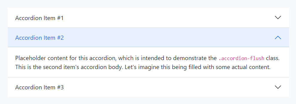
10. New accordion
Bootstrap 5 adds support for brand new .accordion component. The new accordion includes Bootstrap Icons as chevron icons indicating state and click-ability. You can also use .accordion-flush to remove the default background-color, some borders, and some rounded corners to render accordions edge-to-edge with their parent container.
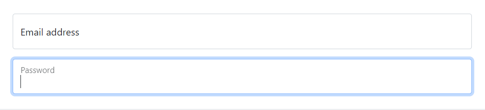
11. Floating labels in Form Inputs
A new floating label support has also been added in bootstrap 5. This behavior is similar to the behavior shown by many material design UI frameworks such as MDB. Form validation styles also work as expected with floating labels present.
12. Placeholder component
A new placeholders component has been added that allows you to create UI while your app is still loading.
13. RTL support

Bootstrap 5 now includes RTL support. RTL (right-to-left) support means that you can build websites in languages such as Arabic, Hebrew, Pashto, Persian, Urdu, and Sindhi. The writings in these languages starts from the right of the page and continues to the left which demands it’s own specific style settings in order to accommodate with your overall design. Now that Bootstrap 5 has the RTL support in-build, you will be able to use RTL versions of Bootstrap CSS file to create RTL websites. Check docs and examples for RTL.
14. Easier customization & theming
Bootstrap 5 offers a new Customize section which expands on v4’s theming page with more content and code snippets for building on top of Bootstrap’s source Sass files. A npm starter project is also provided to help you get started with customizing Bootstrap faster. Setting up Bootstrap with Parcel is also now documented.
15. Namespaced data attributes
Bootstrap utilizes HTML attributes to enable JavaScript behaviors. In Bootstrap 5, all such attributes have been renamed from data-* to data-bs-*. Thus all data attributes in Bootstrap 5 not contain bs as an infix. You will need to do find all replace all such data attributes when moving from Bootstrap 4 to 5, however going forward this will keep the data attribute naming of Bootstrap separate from that required by any other libraries or your own.
16. Popper.js v2
Tooltips and popovers in Bootstrap are powered by Popper.js. In Bootstrap 5, v2 of Popper.js has been adopted which brings small breaking changes:
- Removed
offsetoption from Tooltip/Popover and Dropdown. This can now be achieved using thepopperConfigparameter. - The
fallbackPlacementoption has becomefallbackPlacements.
17. SVG Icon Library
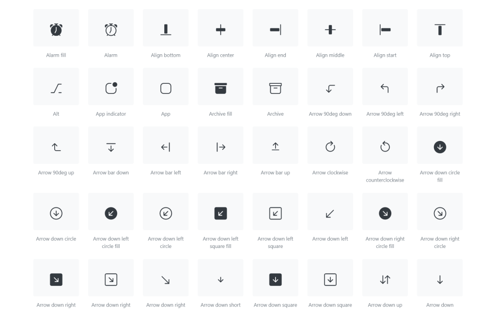
Bootstrap now offers SVG library of 1,000+ icons that are easy to integrate in your code. You can add these icons by inline code or SVG sprite. A web font version will also be introduced with the stable release of this icon library. We have been using this icon library in our current projects (including Bootstrap 4) and have found it to be quite extensive.
18. Better Documentation & Examples
You will also notice a new look and feel to the Bootstrap 5 documentation site which has been revamped to improve readability. Sidebar in documentation now uses expandable sections for faster navigation. You will also find improved Sass docs which will help you customize the default Bootstrap experience.
New examples have been added with several snippets for headers, heroes, jumbotron, features, and sidebars.
19. Hugo over Jekyll for site generation
Bootstrap’s documentation site has adopted Hugo over Jekyll for its static site generation. Hugo is a popular and fast cross platform static site generator written in Go. You can learn about top static site generators here.
20. New Logo
Lastly, Bootstrap 5 now sports a brand-new logo (attached at the start of the article).
Migrating from Bootstrap 3 to 4
With these changes in mind, this article hopes to serve as a (non-exhaustive) step-by-step guide for migrating an existing Bootstrap 3 website to Bootstrap 4. To this end, we will be utilizing a small, single-page, demo website built using sample snippets provided by the official Bootstrap 3 documentation. Figure 1 below illustrates the landing page of this website.

Figure 1: The landing page of our demo website, built using sample snippets found in the official Bootstrap 3 documentation.
It is composed of a top nav bar, a carousel, an alert and a grid using panels, followed by a pagination component.
Adding Bootstrap 4
The first step on our migration journey is to replace the Bootstrap 3 reference (stylesheet and JavaScript file) with the Bootstrap 4 equivalent. To do so, first install Bootstrap 4 using bower install bootstrap#v4.0.0-alpha.4. This should create a new folder, bower_components, in your working directory.
Replace the Bootstrap 3 stylesheet reference with:
< link rel="stylesheet" href="bower_components/bootstrap/dist/css/bootstrap.min.css" />
Similarly, replace the Bootstrap 3 JavaScript reference with:
< script src=“bower_components/bootstrap/dist/js/bootstrap.min.js">
Instead of bower, one can also use npm (npm install [email protected]), or composer (composer require twbs/bootstrap:4.0.0-alpha.5) to install Bootstrap.
Alternatively, as per the Bootstrap 4 documentation, you can use the Bootstrap 4 CDN:
< link rel="stylesheet" href="https://maxcdn.bootstrapcdn.com/bootstrap/4.0.0-alpha.5/css/bootstrap.min.css" integrity="sha384-AysaV+vQoT3kOAXZkl02PThvDr8HYKPZhNT5h/CXfBThSRXQ6jW5DO2ekP5ViFdi" crossorigin="anonymous" >
< script src="https://maxcdn.bootstrapcdn.com/bootstrap/4.0.0-alpha.5/js/bootstrap.min.js" integrity="sha384-BLiI7JTZm+JWlgKa0M0kGRpJbF2J8q+qreVrKBC47e3K6BW78kGLrCkeRX6I9RoK" crossorigin="anonymous">
Save and refresh. Our demo page should now appear broken, as shown in figure 2 below.

Figure 2: The landing page of our demo website rendering incorrectly after including Bootstrap 4.
Fixing the navigation bar
First, let’s look into fixing the navigation bar. Our Bootstrap 3 nav bar is defined as follows:
<nav class="navbar navbar-default">
    <div class="container-fluid">
      <div class="navbar-header">
          <a class="navbar-brand" href="#">Brand</a>
      </div>
      <div class="collapse navbar-collapse" id="navbar-collapse">
        <ul class="nav navbar-nav">
          <li class="active"><a href="#">Home <span class="sr-only">(current)</span></a></li>
          <li class="dropdown">
            <a href="#" class="dropdown-toggle" role="button">Dropdown <span class="caret"></span></a>
            <ul class="dropdown-menu">
              <li><a href="#">Item 1</a></li>
              <li><a href="#">Item 2</a></li>
              <li><a href="#">Something else here</a></li>
              <li role="separator" class="divider"></li>
              <li><a href="#">Item 3</a></li>
            </ul>
          </li>
        </ul>
      </div>
    </div>
</nav>
Bootstrap 4 greatly simplifies the navbar. However, this simplification will require us to make several changes to our markup, in order to get the navbar working again. Firstly, we no longer need the div, wrapping the navbar contents, to which the container-fluid class is applied, because navbars are now fluid by default. We also no longer need to explicitly specify that the navbar items are collapsible. Hence, we can remove the div to which the class collapse navbar-collapse was assigned. Last but not least, we also no longer require the navbar-header class, so we can also remove that element.
Bootstrap 4 also requires that a color scheme be specified for the navbar.
For more information on color schemes see https://v4-alpha.getbootstrap.com/components/navbar/#color-schemes
Let’s go ahead and apply navbar navbar-light bg-faded to the nav element.
Any navbar list item now requires the nav-item class. Similarly, any links must have the nav-link class applied to them. Both the nav-item and nav-link classes ensure that the display type is set to inline-block.
Finally, we must also apply the dropdown-item to all dropdown items (more on this later).
Our Bootstrap 4 navigation markup now looks as follows:
<nav class="navbar navbar-light bg-faded">
  <a class="navbar-brand" href="#">Brand</a>
    <ul class="nav navbar-nav">
          <li class="nav-item active"><a class="nav-link" href="#">Home <span         class="sr-only">(current)</span></a></li>

          <li class="nav-item dropdown">
            <a href="#" class="nav-link dropdown-toggle" data-        toggle="dropdown" role="button" aria-haspopup="true" aria-expanded="false">Dropdown <span class="caret"></span></a>
    <ul class="dropdown-menu">
      <li class="dropdown-item"><a href="#">Item 1</a></li>
      <li class="dropdown-item"><a href="#">Item 2</a></li>
      <li class="dropdown-item"><a href="#">Something else here</a></li>
      <li role="separator" class="divider"></li>
      <li class="dropdown-item"><a href="#">Item 3</a></li>
    </ul>
  </li>
  </ul>
</nav>
As can be seen above, the markup required for the Bootstrap 4 navbar is much flatter and simpler, causing it to render faster, and making it easier to parse by the reader.
Replacing panels
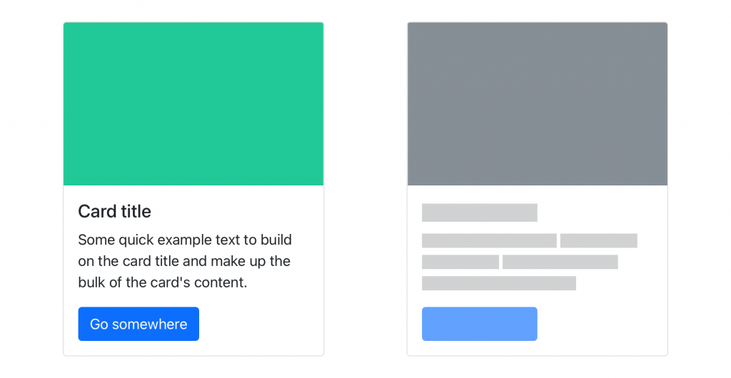
As noted in the introduction, Bootstrap 4 dropped support for panels, wells and thumbnails. Instead, developers should make use of a new Bootstrap 4 concept: cards. Cards aim to merge the three aforementioned components into one, flexible, component that supports various types of content at the same time. For example, cards support images, lists, footers and headers, and as such are much less restrictive than their individual counter-parts.
Our demo website defines a series of panels within a 4x2 grid. The markup for each panel is as follows:
<div class="panel panel-default">
        <div class="panel-body">
              Lorem ipsum dolor sit amet, posse fabellas periculis at mei, fierent suscipiantur, in mei populo eloquentiam. Vel luptatum             repudiare tincidunt cu. An mei adhuc imperdiet signiferumque.
        </div>
</div>
We will go ahead and replace each occurrence of these panels with a card. The simplest form of card is defined (figure 3):
<div class="card">
    <div class="card-block">
        <p class="card-text">
            Lorem ipsum dolor sit amet, posse fabellas periculis at mei,             sit at fierent suscipiantur, in mei populo eloquentiam. Vel             luptatum repudiare tincidunt cu. An mei adhuc imperdiet                 signiferumque.
              </p>
    </div>
</div>
Figure 3: The simplest form of cards, containing only a card text, and no title or image.
Since cards offer various types of content, we could add a title, an image and some links, using the card-title, card-img-* and card-link classes respectively (figure 4):
<div class="card">
<img class="card-img-top" src="beach.jpg" alt="Card image cap">
          <div class="card-block">
              <h4 class="card-title">Surf it up!</h4>
              <p class="card-text">
                    Lorem ipsum dolor sit amet, posse fabellas periculis at                 mei, sit at fierent suscipiantur, in mei populo                     eloquentiam. Vel luptatum repudiare tincidunt cu. An mei                 adhuc imperdiet signiferumque.
              </p>
        </div>
        <div class="card-block">
          <a href="#" class="card-link">Stoked!</a>
    <a href="#" class="card-link">Hang lose!</a>
      </div>
</div>
Figure 4: A card containing an image, title and two links.
Updating pagination
Bootstrap 4 introduced two new classes to use for pagination:
1. page-item which adjusts the display to inline, and sets the margins of the first and last children
2. page-link which adjusts the border, position, margin and text decoration of an anchor element.
As such, we must update the Bootstrap 3 pagination markup, from:
<nav aria-label="Page navigation">
<ul class="pagination">
<li>
<a href="#" aria-label="Previous">
<span aria-hidden="true">«</span>
</a>
</li>
<li><a href="#">1</a></li>
<li><a href="#">2</a></li>
<li><a href="#">3</a></li>
<li><a href="#">4</a></li>
<li><a href="#">5</a></li>
<li>
<a href="#" aria-label="Next">
<span aria-hidden="true">»</span>
</a>
</li>
</ul>
</nav>to:
<nav aria-label="Page navigation">
<ul class="pagination">
<li class="page-item">
<a class="page-link" href="#" aria-label="Previous">
<span aria-hidden="true">«</span>
</a>
</li>
<li class="page-item"><a class="page-link" href="#">1</a></li>
<li class="page-item"><a class="page-link" href="#">2</a></li>
<li class="page-item"><a class="page-link" href="#">3</a></li>
<li class="page-item"><a class="page-link" href="#">4</a></li>
<li class="page-item"><a class="page-link" href="#">5</a></li>
<li class="page-item">
<a href="#" aria-label="Next" class="page-link">
<span aria-hidden="true">»</span>
</a>
</li>
</ul>
</nav>Updating the carousel
The changes to the carousel code are minor. In Bootstrap 3, a carousel is defined through the following markup:
<div class="carousel-inner" role="listbox">
        <div class="item active">
          <img class="first-slide" src="http://placehold.it/1150x450" alt="First slide">
          <div class="container">
            <div class="carousel-caption">
              <p>Note: The sample carousel image was created using <code>placehold.it</code>Donec id elit non mi porta gravida at eget metus. Nullam id dolor id nibh .</p>
              <p><a class="btn btn-lg btn-primary" href="#" role="button">Click me!</a></p>
            </div>
          </div>
        </div>
    <!-- Other carousel items here -->
</div>
The only changes required are
i) Renaming the item class to carousel-item
ii) Replacing the Glyphicon classes with icon-prev and icon-next
Glyphicons
Although the demo project discussed in this article does not use of Glyphicons, and important change to point out is the removal of Glyphicons from Bootstrap 4. As a result of this decision, Bootstrap 4 may be more light-weight, and may have a smaller footprint than its predecessor. This means that icon sets now need to be included manually - which is advantageous as one is now no longer coupled to the default Bootstrap icon set.
Updating Dropdowns
As already noted previously, Bootstrap 4 dropdown list items are now required to have the dropdown-item class applied to them. Furthermore, the dropdown menu is no longer required to be an anchor tag - instead, one can use buttons. Aside from these two changes, the classes used to define a dropdown menu remain the same for Bootstrap 4.
The Grid System
The most striking change to the Bootstrap grid system is the introduction of a new grid tier, which contains a breakpoint at 480px. This gives Bootstrap 4, four grid tiers, instead of 3: xs, sm, md, and lg.
The addition of the sm grid tier means that Bootstrap now has five breakpoints:
• An extra-small breakpoint for handheld devices that boast a smaller screen than normal (0px)
• A small breakpoint aimed at phones / handhelds (544px)
• A breakpoint for screens of medium size, such as tablets (768px)
• A breakpoint for large screens - that is, desktops (992px)
• An extra-large breakpoint to support wide-screen (1200px)
Furthermore, the offsetting of columns has changed, from .col-*-offset-** to .offset-*-**. That is, .col-md-offset-* now is .offset-md-*. Likewise, the pushing of columns changed from .col-push-*-* to .push-*-*.
Conclusion
In this article, we took a brief look into migrating a simple, existing Bootstrap 3 website to Bootstrap 4. The website was constructed using various sample snippets encountered in the official Bootstrap 3 documentation. Although the overall task may have appeared daunting at first, the changes themselves were straight forward - with the most effort being expended by updating the navigation bar and replacing panels with cards. In summary, the major changes that one should watch out for are:
• The replacement of panels, wells and thumbnails with cards
• The renaming of classes and the introduction of a new grid tier
• The removal of Glyphicons
• The replacement of badges with labels
• The simplification of the navigation bar
• The introduction of additional classes around dropdowns and pagination